
Start with the job, not the shade
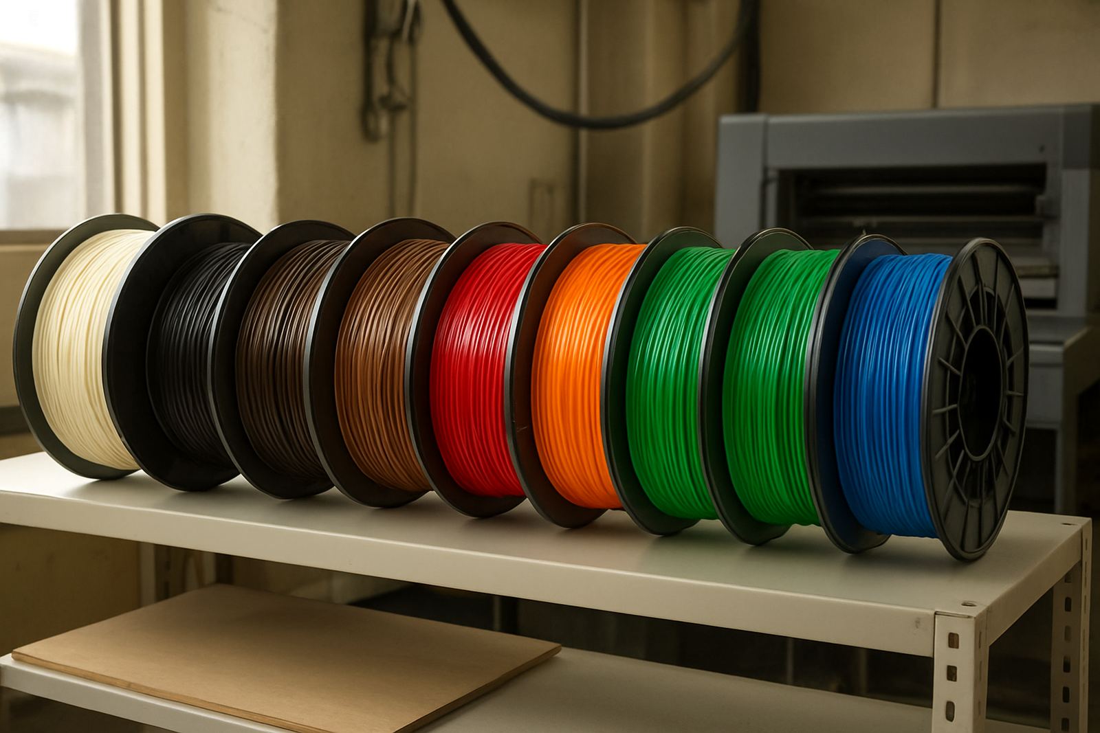
When you are choosing filament colour, begin with where the part will be used. A prototype for internal testing does not need the same finish as a cover that will sit in a reception area or on a retail shelf. PETG is often chosen because it is practical, tough and stable enough for real use, so colour should support that purpose rather than fight it.
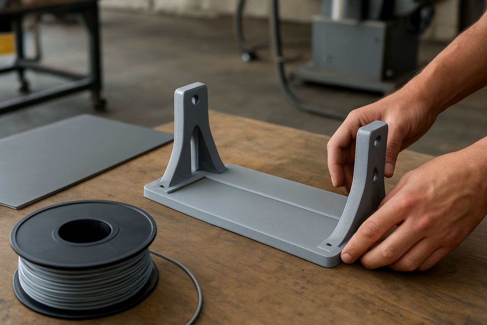
For engineering tests, plain colours like black, grey or natural usually make sense. They show form, holes and edges clearly, and they keep the focus on function. For final parts, colour becomes part of the brief. A bracket behind equipment may disappear best in black, while a visible guard, label holder or display part may need white, clear or a specific colour to match the space.
In Cape Town and surrounding areas, many customers ask for colour before they ask for size. That is fine, but it helps to think about light, dust and handling as well. A white part in a dusty workshop can show dirt quickly, while a darker part may hide marks but can make layer lines more obvious under strong light.
How colour changes what you notice on a printed part
Different colours change how a PETG print reads once it leaves the machine. Lighter shades make edges, text and defects easier to spot. Darker shades can hide small scuffs better, but they can also make fine detail harder to see in dim light. If a part will be checked by staff during assembly or maintenance, that matters.
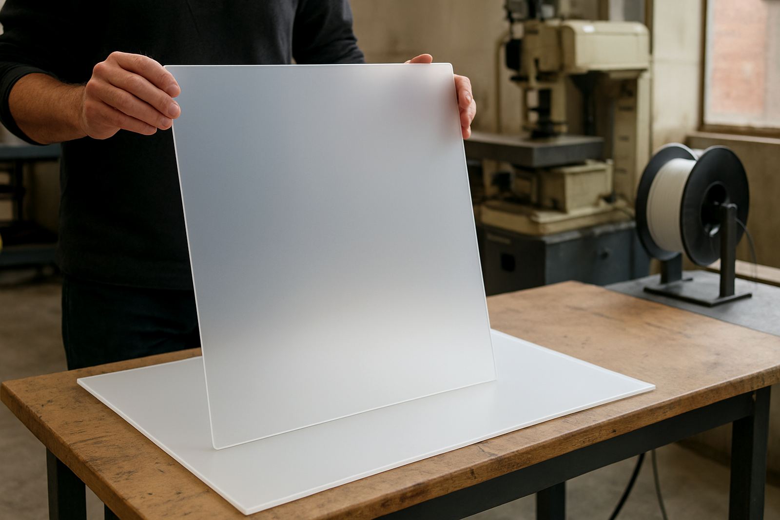
Colour can also affect the way people judge quality. A smooth print in a solid colour often looks more polished than the same part in a translucent shade. On the other hand, transparent or translucent filament can be useful when you need to see internal features, fluid levels or light transmission. For covers, guards and test housings, that can save time later.
- Use light colours for inspection, marking and training parts.
- Use darker colours for parts that will be handled often.
- Use clear or translucent PETG when visibility inside the part matters.
- Use a neutral colour when the part may be revised again later.
If you are matching several printed parts in one system, try to keep the colour choice consistent across the set. A mixed set of colours can confuse installers and make a job look unfinished, even when the dimensions are correct.
Match colour to the room, machine or brand environment
Visible fixtures should suit the place where they are installed. In offices, retail spaces and showrooms, colour is part of how the part sits in the room. In factories, colour often needs to support safety or identification. A bright insert can highlight a warning point, while a dark cover can blend in with equipment.
For local clients in places like Epping, Montague Gardens and Bellville, we often see a split between production use and customer-facing use. Production parts usually lean towards practical tones, while display items need a cleaner look. A Somerset West client fitting out a reception counter might prefer white or clear panels, while a Paarl workshop may want black parts that stay neat between cleanings. It is all about the setting.
Colour also affects how maintenance staff work with the part. If a panel needs to be opened after load-shedding or during night shifts, a strong contrast colour can help people identify the correct section fast. That kind of detail saves time and reduces mistakes.
- Choose colours that suit wall paint, machine housings or signage nearby.
- Use contrast where staff need quick visual identification.
- Avoid very pale colours in dirty or high-touch areas unless the part is cleaned often.
- Keep safety markings clear and separate from decorative colour choices.
Prototype colours: keep testing simple and honest
For prototypes, colour should help you make decisions, not hide them. If you are checking fit, wall thickness or part movement, choose a colour that makes the print easy to inspect. Grey is often a practical middle ground because it shows detail without drawing too much attention. Black is useful too, but it can hide surface issues in poor light.
When a prototype is being shown to a client, colour can influence feedback more than people expect. A part in a bright colour may get comments about style instead of function. A neutral colour keeps the conversation on fit and finish. That is useful when you are still changing dimensions or revising a clip, hinge or mount.
If the prototype is going out to site, think about transport and handling too. In a couriered job, clear labelling and the right colour can help the receiver identify revisions quickly. That matters when a team in Stellenbosch is waiting for a corrected sample while installation work is already under way. One missed revision can cost a day.
Finished parts need colour that lasts beyond first impressions
Once a part is moving into final use, colour becomes part of the product life. The right choice should keep looking acceptable after cleaning, handling and long exposure to indoor light. PETG is often used for items that need a practical finish, so the colour should stay believable over time and not look out of place after a few months.
For visible fixtures, ask whether the part should blend in or stand out. A blend-in part may be better in black, grey or white. A stand-out part may use a brighter shade for easy identification. This is common in retail fitting, workshop guards and custom holders. If the item sits near windows or under bright lights, ask how the colour reads in daylight as well as under indoor lighting.
Colour can also support cleaning routines. A smooth, darker surface may hide fingerprints better, while a light surface can show dust sooner and encourage regular wipe-downs. In humid coastal areas, that is worth thinking about because dust and moisture can leave marks more quickly on some finishes.
Order planning: colour, quantity and cut size work together
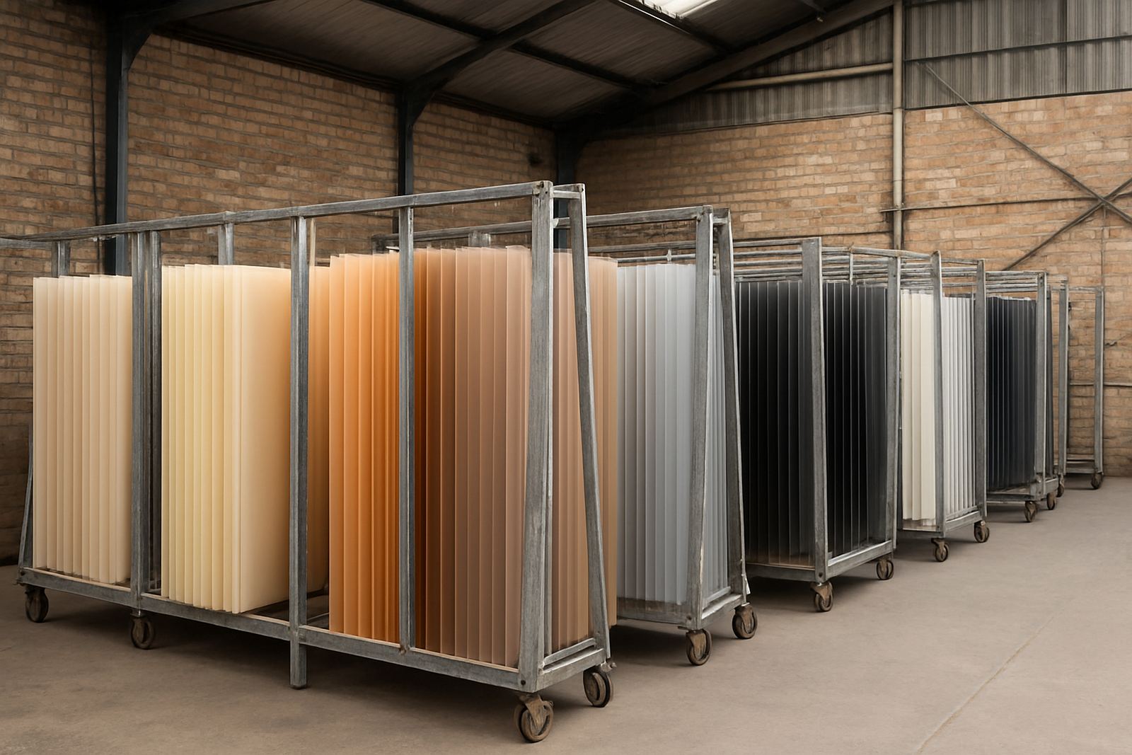
Choosing filament colour is easier when you know the full job. If you need a sheet cut to size, a filament run for sample parts, or a small batch for repeated use, the colour choice should be locked in before cutting and packing begins. That avoids delays and keeps the whole order consistent.
For many jobs, it helps to separate the brief into three parts: the function, the finish and the location. Function tells you whether the part is structural, decorative or protective. Finish tells you whether the surface needs to look clean, discreet or visible. Location tells you whether it will live in an office, workshop, shop floor or outside covered area. Once those are clear, the colour choice becomes much easier.
- Confirm whether the part is a prototype, final part or visible fixture.
- Decide if the colour should hide marks or highlight detail.
- Check whether the job will be handled, cleaned or couriered often.
- Keep the colour consistent across repeat orders and replacement parts.
If you are unsure, ask for material advice before you place the order. A quick check on the intended use can save waste, especially when the same colour must suit several parts across one site.